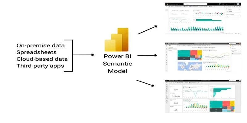
Data becomes far more meaningful when it’s presented in a way that people can understand at a glance. Power BI offers a robust set of built-in visuals, but sometimes they feel too basic or generic for specific reporting needs. This is where custom visuals in Power BI really excel. These add-ons allow you to tell your story in a way that suits your audience and the type of data you’re working with. Instead of forcing your data into standard charts, you can shape visuals around the insights you wish to highlight. Let’s explore five of the most effective custom visuals and how they can enhance your reports.
Top 5 Custom Visuals in Power BI for Smarter Dashboards
Chiclet Slicer
Slicers help users interact with data by filtering what they see. The default slicer in a Power BI dashboard is functional but plain, often blending into the background. Chiclet Slicer transforms the concept into something more engaging. Rather than using checkboxes or lists, it displays options as tiles, which can include images, text, or a mix of both.

This makes reports more intuitive, especially for audiences unfamiliar with dashboards. You can design the chiclets to match your theme, control how many tiles show per row, and adjust their shape to fit the space. The ability to use images as selectors is particularly useful for product categories, team members, or geographic areas where a visual cue is more effective than text alone.
Bullet Chart
Comparing performance against a target is a common requirement, but standard charts often clutter the view with separate bars, labels, or lines. The Bullet Chart addresses this by layering everything into a single, compact space. It displays actual performance as a bar, with a target line and shaded ranges representing qualitative thresholds.
This helps readers quickly gauge where they stand without cross-referencing figures or legends. For instance, a manager reviewing quarterly results can see at a glance whether sales fell below minimum expectations, hit the expected range, or exceeded it.
Hierarchical Bar Chart
Many datasets have natural hierarchies — for example, region > country > city, or department > team > individual. A flat bar chart struggles to show these relationships clearly. The Hierarchical Bar Chart allows you to structure the data so viewers can start at the top level and drill into deeper levels directly within the chart.
At the surface level, it shows the main categories. Clicking on any category expands it to reveal subcategories below, while collapsing others to keep the focus clear. This visual is helpful when audiences need both summary and detail in the same view.
KPI Ticker
Dashboards often need to communicate several key figures at once, but crowding a screen with too many static numbers can make them hard to follow. The KPI Ticker adds movement and variety by scrolling KPIs across the screen, similar to a news ticker.

This is ideal for summary screens or shared monitors where people are only glancing for a moment. You can queue up metrics like revenue, active users, or support tickets resolved, and they’ll cycle through automatically. The scrolling motion draws attention without distracting from the rest of the report.
Synoptic Panel
Sometimes numbers make the most sense when tied to a location or layout. The Synoptic Panel lets you upload a custom image and define clickable regions that display data for each area. Unlike a standard map visual, it works with any image, not just geographic maps.
For example, a facility manager could see output by machine directly on a diagram of the factory floor, or a retailer could track sales by department in the context of the store’s layout. This kind of spatial storytelling makes dashboards feel more relatable to end users.
Conclusion
Custom visuals in Power BI help you move beyond generic dashboards and design reports that truly resonate with your audience. The Chiclet Slicer makes filters intuitive and interactive, while the Bullet Chart clarifies performance in tight spaces. The Hierarchical Bar Chart helps users explore complex data step by step, and the KPI Ticker adds motion to keep high-level figures in focus. Finally, the Synoptic Panel ties your data to meaningful layouts or diagrams, making insights easier to grasp. Choosing the right visuals for your report isn’t just about aesthetics — it’s about empowering people to understand and act on the story your data is telling.
For more tips on enhancing your data visualization skills, consider checking out Power BI’s official resources or exploring community forums for shared insights and experiences.
 zfn9
zfn9
