 zfn9
zfn9
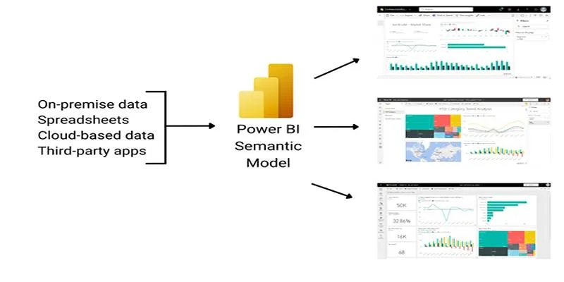
Data is only as powerful as how well it’s communicated. Power BI, Microsoft’s flagship data visualization tool, helps transform rows of numbers into visuals that tell a story. But with so many visuals available, which charts are most effective? In this guide, we’ll explore the 10 most commonly used Power BI charts and break down their advantages. This will help you choose the right visual for your data—without any guesswork.
1. Bar and Column Charts
Bar and column charts are foundational in Power BI. Column charts illustrate data using vertical bars, while bar charts display horizontal bars. They’re great for comparing different categories or tracking changes over time.
Why It’s Popular:
- Easy to read for both technical and non-technical users
- Useful for comparing multiple items side by side
- Interactive with drill-down and filtering support
These charts can be stacked, clustered, or displayed as 100% stacked charts for percentage-based analysis. This chart type has evolved with new customization options in Power BI, making it even more interactive and valuable in modern business intelligence environments.
2. Line Charts
Line charts are used to show trends over continuous time periods. They connect data points using lines and work well for visualizing growth, patterns, and fluctuations.
Why It’s Popular:
- Excellent for time-series analysis
- Supports multiple data series
- Smooth transition and customization options
Line charts can be enhanced with markers to highlight specific points. Power BI’s customization options allow users to add reference lines or use conditional formatting to enrich line charts.
3. Pie and Donut Charts

These circular charts represent proportions of a whole. While pie charts show a single series, donut charts add a hole in the center for a modern look or extra data.
Why It’s Popular:
- Visually intuitive
- Best for quick proportion analysis
- Ideal for simple comparisons
The circular layout of pie charts makes it intuitive for users to identify dominant segments in a dataset. However, be cautious using too many slices to avoid cluttering the visual. Pie charts may lack precision but are excellent for quick overviews in dashboards.
4. Area Charts
Area charts fill the space beneath a line chart to emphasize volume. They’re ideal for cumulative data, such as revenue over time or user growth.
Why It’s Popular:
- Highlights quantity over time
- Great for comparing parts of a whole
- Works well for stacked data
Area charts can become difficult to interpret when many series overlap. Still, they offer a quick visual sense of scale and volume changes.
5. Scatter and Bubble Charts
Scatter charts plot two measures using x and y axes. Bubble charts add a third value, using size to represent the third dimension.
Why It’s Popular:
- Perfect for correlation and distribution analysis
- Spotting clusters and outliers
- Shows the relationship between variables
These visuals are useful in identifying patterns and are best when data relationships need examination. They allow multidimensional exploration without overwhelming the viewer.
6. TreeMap
TreeMaps display data hierarchically using nested rectangles. Each box’s size and color represent different values.
Why It’s Popular:
- Visualizes part-to-whole relationships
- Space-efficient
- Highlights dominant data categories
When using TreeMap, it’s important to structure the hierarchy meaningfully. It’s especially helpful when communicating with stakeholders who prefer visual clarity over complex analytical visuals.
7. Waterfall Charts
Waterfall charts show incremental increases and decreases in a value across a process—ideal for financial breakdowns.
Why It’s Popular:
- Displays cumulative effect of values
- Useful for revenue and cost analysis
- Great for explaining performance shifts
Waterfall charts are highly effective for executive-level summaries, especially when illustrating financial breakdowns. They clarify how a starting value changes over time due to different inputs.
8. Funnel Charts
Funnel charts represent stages in a process—most often used in marketing or sales pipelines.
Why It’s Popular:
- Tracks process performance
- Shows drop-offs and conversion rates
- Simple and linear flow
Funnel charts are not limited to sales data; they can represent any process with defined stages. Each stage’s width represents the volume at that point, making it easy to spot bottlenecks.
9. Gauge Charts

Gauge charts look like speedometers and show progress toward a target. They are best for key metrics, such as performance against goals.
Why It’s Popular:
- Quick performance snapshots
- Visual appeal
- Easy-to-understand for stakeholders
Users often pair gauge charts with KPIs to monitor business performance in real time. While they show only a single metric, they are effective for dashboards.
10. Maps
Power BI’s map visuals help visualize location-based data using shapes, bubbles, or colors.
Why It’s Popular:
- Great for geographic data
- Adds visual context to locations
- Integrates with Bing for real-time mapping
Power BI Maps use Bing Maps integration, allowing dynamic zooming and precise geo-mapping. It’s one of the most intuitive ways to spot regional trends or compare data across territories.
How to Choose the Right Chart?
Choosing the best chart isn’t just about appearance—it’s about data clarity.
Here’s what to consider:
- Understand your data: Is it categorical, numerical, hierarchical, or geographic?
- Define the message: Are you showing comparison, trend, part-to-whole, or distribution?
- Know your audience: Simple visuals work better for broad audiences.
- Avoid clutter: More data doesn’t mean more insight. Use filters and legends wisely.
- Check interactivity: Use slicers, drill-throughs, and filters to let users explore data.
Conclusion
Power BI charts are essential tools for transforming raw data into actionable insights. Whether you’re visualizing trends over time with line charts or highlighting process drop-offs using funnel visuals, each chart type serves a unique purpose. Understanding the strengths and limitations of each helps ensure your data is not only presented clearly but also interpreted correctly by your audience.
By selecting the right chart based on your data type and communication goals, you create dashboards that are not just functional—but genuinely insightful. The 10 charts covered in this guide are among the most widely used and effective, making them a great starting point for building impactful reports. With practice and thoughtful design, Power BI charts can become powerful tools in your decision-making process.