 zfn9
zfn9
When exploring a dataset, summary statistics like the mean or median often fall short. While they provide insight into the center of your data, they reveal little about its overall shape. This is where violin plots excel. These plots offer a detailed view of how values are distributed across a variable, combining the simplicity of box plots with the richness of density plots.
This guide delves into violin plots as a visual tool for a deeper understanding of data distribution. Whether you’re a beginner trying to grasp data variability or someone fine-tuning model inputs, this is an essential chart in your data science toolkit.
What Is a Violin Plot?
A violin plot is a hybrid between a box plot and a kernel density plot. It provides a mirrored view of a data distribution’s probability density around a central axis. In simple terms, it shows not only where the data is centered and how spread out it is, but also its shape—where values concentrate and where they’re sparse.
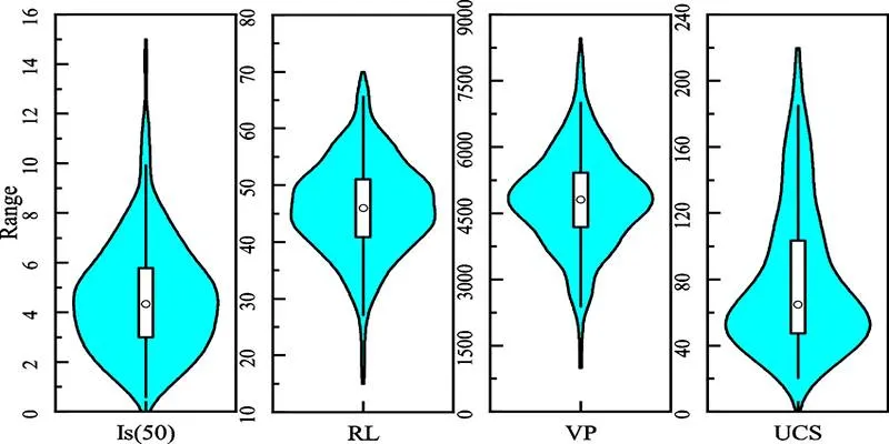
Unlike box plots, which only show quartiles and medians, violin plots display the full distribution. You can visually detect skewness, multimodality (multiple peaks), and outliers with greater clarity.
Main Components of a Violin Plot
Understanding how to read a violin plot begins with knowing what its parts represent:
- White dot in the center: This marks the median value of the dataset.
- Thick bar in the middle: Represents the interquartile range (25th to 75th percentile).
- Thin line: Extends to the minimum and maximum non-outlier values.
- Violin shape: Shows the kernel density estimate. Wider sections represent higher data density.
This density plot component is what gives the violin plot its name—the symmetrical shape often resembles the body of a violin.
Kernel Density Estimation (KDE) in Violin Plots
The violin shape is constructed using a method called Kernel Density Estimation (KDE). KDE is a way to estimate the probability density function of a dataset, smoothing out the data to reveal where values are concentrated.
Three core parts of KDE:
- Kernel Function: Assigns weight to each point, typically using a Gaussian function.
- Bandwidth: Controls the level of smoothness. A larger bandwidth gives smoother curves, while a smaller one shows more bumps and details.
- Summation: Combines all individual kernels to produce the overall density curve.
In violin plots , the KDE is mirrored along the axis, giving it the recognizable violin shape. This representation gives immediate visual clues about the presence of clusters, gaps, or outliers in the data.
When to Use Violin Plots?
Violin plots are particularly useful when:
- You’re comparing distributions across multiple groups.
- You want to detect patterns, such as bimodal or skewed distributions.
- You’re analyzing simulation results or residuals in model evaluations.
Because they combine both visual density and statistical summary, violin plots are often more informative than box plots alone.
Violin Plot vs. Box Plot vs. Density Plot
Here’s a quick comparison of these common distribution tools:
| Feature | Violin Plot | Box Plot | Density Plot |
|---|---|---|---|
| Shows median | Yes | Yes | No |
| Displays quartiles | Yes | Yes | No |
| Detects outliers | Yes | Yes | No |
| Visualizes density | Yes | No | Yes |
| Reveals multimodal data | Yes | No | Yes |
As seen above, violin plots offer the best of both worlds—statistical summary and data shape.
Reading Violin Plots: What to Look For
When you examine a violin plot:
- Width of the plot at a given value indicates the number of observations near that point. Wider = more data.
- Symmetry suggests balanced distributions, while asymmetry hints at skewness.
- Multiple bumps in the shape suggest multiple modes (peaks), indicating subgroups in the data.
- Outliers are usually small dots outside the main shape, offering insight into rare or extreme values.
Even without numerical labels, a well-designed violin plot provides a powerful visual summary of complex data.
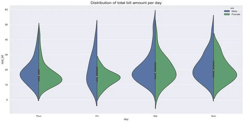
Grouped Violin Plots for Deeper Comparisons
Violin plots become even more powerful when comparing groups. For instance:
- Side-by-side violins allow comparisons of different categories.
- Split violins show two related distributions (e.g., before and after treatment).
- Colored violins enhance distinction across multiple dimensions.
This grouping makes violin plots ideal for comparing distributions in segmented data, such as customer categories, experiment groups, or feature groups.
Customizing Violin Plots
Several elements can be customized to make violin plots more informative:
- Orientation: Horizontal violins can save space and improve readability.
- Points overlay: Show raw data points for more transparency.
- Bandwidth tuning: Adjust KDE bandwidth for more or less smoothness.
- Color encoding: Use different colors for subgroups or categories.
All these options allow data professionals to tailor the plot to fit their exact needs and audience.
Tips for Creating Effective Violin Plots
To maximize the effectiveness of your violin plots, it’s crucial to approach their design with intention and care. Violin plots are particularly useful for datasets that are multimodal , skewed , or contain non-normal distributions , as they can reveal underlying patterns that box plots might miss. However, to enhance their clarity:
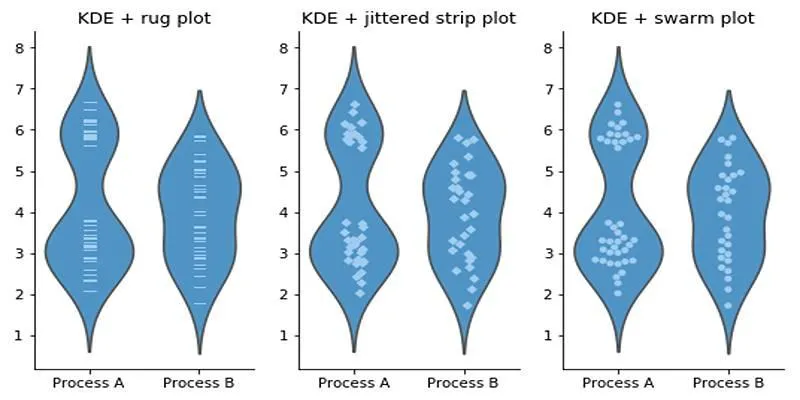
- Consider overlaying raw data points (such as jittered scatter plots or swarm plots) when the sample size is small. This provides context and reinforces the distribution insights.
- If helpful, include summary statistics like the median or quartiles to make interpretation easier for viewers less familiar with violin plots.
- KDE bandwidth settings must be chosen carefully. A bandwidth that’s too large may oversmooth the plot and hide important structures, while one that’s too small might exaggerate noise.
- For categories with very few observations, avoid overinterpreting the density curve , as it may not accurately represent the population.
These thoughtful practices ensure that your violin plots remain both visually appealing and analytically reliable.
Conclusion
Violin plots offer a unique advantage in data visualization. By combining the statistical insight of box plots with the detail of density plots, they allow you to fully grasp how data is spread across categories. Whether you’re working through feature distributions or evaluating model outputs, they offer a valuable perspective.
Though they may require some getting used to, violin plots help unlock deeper insights hidden within your data. When precision and clarity matter—especially in complex datasets—these plots become an essential visualization choice.