 zfn9
zfn9
Data science is full of questions—lots of them. But finding the answers means more than just pulling numbers from a spreadsheet. You need to see patterns, draw comparisons, and turn raw data into something actionable. That’s where Tableau comes in. Known for its visual-first approach, Tableau helps data scientists explore, explain, and share findings in a way that’s both clear and practical. Let’s dive into what makes Tableau stand out, how it’s used in data science, and the value it brings to the table—pun intended.
Why Tableau Makes Sense for Data Science Workflows
Tableau isn’t new, and it wasn’t built just for data science. However, its features align perfectly with how data scientists operate. You’re often juggling multiple datasets, testing hypotheses, and working with colleagues who may not speak SQL or Python. In these moments, Tableau serves as a bridge—between raw data and a finished insight, between you and those who need to understand the outcome.
Visual Thinking Without Coding Overhead
Tableau’s drag-and-drop interface does most of the heavy lifting. You can filter, group, sort, and visualize data without writing code. This doesn’t limit its capabilities; instead, it makes the tool approachable. Whether you’re running regressions or analyzing trends across time, the interface guides your thinking visually, which is immensely helpful in the discovery phase.
Real-Time Analysis with Live Connections
For data scientists working with live data—think financial dashboards or web analytics—Tableau connects directly to data sources like SQL, Google BigQuery, and cloud platforms. This means your dashboards aren’t static; they refresh as the underlying data changes, keeping your work relevant, especially when decisions rely on up-to-date metrics.
Core Applications in the Data Science Process
While Tableau doesn’t replace code-based tools like Python or R, it plays a supporting role in multiple stages of a typical data science pipeline.
1. Data Exploration
Before building models or running tests, you need to understand your data. Tableau assists by turning big, messy tables into interactive visuals. With a few clicks, you can spot outliers, compare variables, or check distribution shapes. For instance, if you’re analyzing housing data, Tableau lets you quickly see how prices shift across neighborhoods or how square footage aligns with cost—without writing a single line of code.
2. Feature Selection and Hypothesis Testing
When deciding which variables matter, Tableau can reveal relationships you might otherwise miss. For example, if you’re building a churn prediction model, visualizing customer age, usage patterns, and payment history can highlight which metrics show noticeable differences between loyal and at-risk users. These visual cues help determine which features should be included in your model.
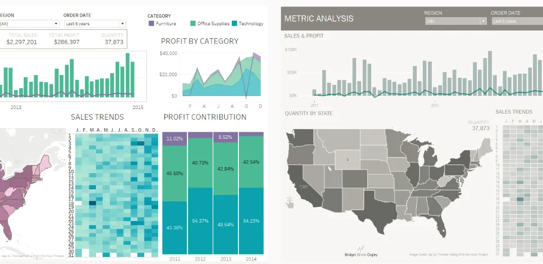
3. Model Monitoring and Communication
Once a model is built and deployed, it needs to be monitored. Tableau excels in creating dashboards where key metrics—like accuracy, recall, or revenue impact—update automatically. This is particularly beneficial when working in teams, where stakeholders want results but don’t have the time (or interest) to dig through Jupyter notebooks.
Benefits That Go Beyond Visuals
The appeal of Tableau isn’t just its ability to create attractive charts. It’s about how those charts integrate into your daily work and how they inform others.
Easier Collaboration
Tableau simplifies sharing work through dashboards or Tableau Server. Instead of explaining results with slides or lengthy documents, you can let the data speak for itself. Anyone can hover over charts, filter by category, or drill into details without risking the integrity of the original dataset.
Stronger Decision-Making
Having the right numbers is one thing; having them seen and understood is another. A clean Tableau dashboard helps decision-makers focus on what matters—whether it’s a red flag in user behavior, a shift in seasonal trends, or a gap in market coverage. Better understanding leads to more informed actions.
Seamless Integration with Coding Tools
While Tableau is a visual tool, it doesn’t operate in isolation. You can export preprocessed data from Python or R into Tableau. Some users even reverse the process—using Tableau to define filters or slices of data and then feeding those into code-based pipelines. The key is flexibility; you can mix and match based on what’s easiest or most efficient.
How to Start Using Tableau in a Data Science Project
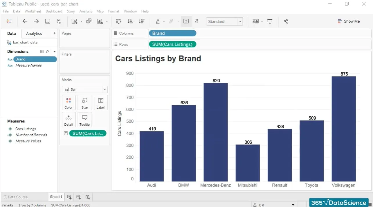
If you’re starting a data science task and want to use Tableau, here’s where it fits in. Whether you’re pulling from a CSV, a cloud warehouse, or a SQL server, Tableau connects directly. Once linked, it shows a preview so you can spot missing values, incorrect column types, or other issues immediately. You can clean data in Tableau or outside it, but keep only what you need. Tableau lets you create calculated fields or filters without switching windows. Want to make a date bucket or flag rows with missing values? You can do it right there.
This is where Tableau excels. Try bar, scatter, line, or box plots, depending on the relationship you’re testing. Use filters to isolate groups and color to highlight changes. This part is about finding the story in the data, not building the final dashboard. Once you know what matters, turn it into a dashboard. Think of it as a control panel for your analysis. Add filters, dropdowns, and tooltips to make it interactive. If someone looks at it and gets the insight in ten seconds, it’s working.
You can share it through Tableau Public or Tableau Server or export it as an image or PDF. The goal isn’t just to deliver—it’s to get feedback. Someone might notice a pattern you missed or find a chart unclear. Tableau makes it easy to adjust without redoing everything.
Closing Thought
Tableau doesn’t try to replace the core tools of a data scientist—it complements them. It brings clarity to complex datasets, encourages exploration, and helps others see what you see. In a field where understanding can make or break decisions, that kind of clarity is invaluable. Whether you’re deep in modeling or presenting results to a client, Tableau provides a clearer way to say, “Here’s what the data says—and here’s why it matters.”