 zfn9
zfn9
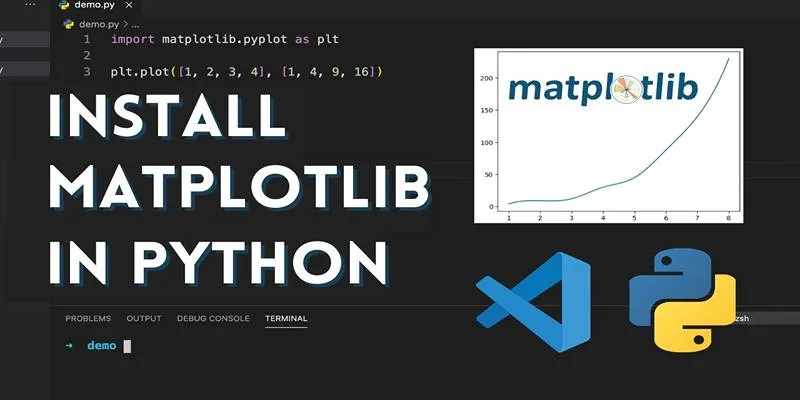
If you’ve ever needed to create simple graphs or visualize data in Python, you’ve probably encountered PyLab. PyLab is a component of the Matplotlib library, widely used for plotting data in Python. It offers a convenient interface that combines NumPy and Matplotlib into a single environment, making plotting much easier—especially for beginners. This post will break down what PyLab is , how to use it, and provide easy-to-understand examples to get you started.
What is PyLab?
Matplotlib includes a module called PyLab that simplifies plotting and numerical operations. It is designed to mimic MATLAB, a popular software used for engineering and mathematical tasks.
Instead of importing multiple libraries separately, PyLab allows users to access functions for plotting and numerical operations simultaneously. This saves time and helps keep the code clean and straightforward.
For example, a single import line:
from pylab import *
provides access to:
- Plotting functions like
plot(),scatter(), andbar() - Numerical operations such as arrays, mathematical functions, and more
- Plot customization tools, including titles, labels, and legends
Why Use PyLab?
PyLab simplifies many tasks for those just starting with Python visualization. While professional developers often prefer using Matplotlib and NumPy separately for more control, PyLab remains a go-to option for beginners and learners.
Here are several reasons why PyLab can be a practical choice:
- It reduces the learning curve for beginners.
- It eliminates the need for multiple imports.
- It offers MATLAB-style syntax, which is helpful for users transitioning from MATLAB.
- It works well in environments like Jupyter Notebooks, where visual feedback is instant.
Setting Up PyLab
To use PyLab, you first need to install the Matplotlib and NumPy libraries. These can be installed using Python’s package manager , pip:
pip install matplotlib numpy
Once installed, PyLab can be imported using the following command:
from pylab import *
It is worth noting that PyLab is not commonly used in modern codebases, as
best practices now suggest importing matplotlib.pyplot and numpy
separately. However, for educational purposes and quick visualization, PyLab
remains useful.
Creating a Basic Plot
One of PyLab’s strengths is its simplicity. Creating a basic line plot involves just a few lines of code:
from pylab import * x = [0, 1, 2, 3, 4] y = [0, 1, 4, 9, 16] plot(x, y) title("Basic Line Plot") xlabel("X Axis") ylabel("Y Axis") grid(True) show()
This example creates a line graph with grid lines, axis labels, and a title.
The show() function is called at the end to display the graph.
Different Plot Types in PyLab
Beyond line plots, PyLab supports various chart types, each useful for different kinds of data. Here are some common plot types beginners can explore:
Scatter Plots
Scatter plots display data points and are commonly used to show relationships or distributions.
x = [1, 2, 3, 4, 5] y = [2, 3, 5, 7, 11] scatter(x, y) title("Scatter Plot Example") show()
Bar Charts
Bar charts are ideal for visual comparisons between categories.
labels = ['A', 'B', 'C'] values = [5, 7, 3] bar(labels, values) title("Bar Chart Example") show()
Histograms
Histograms are used to show the frequency distribution of a dataset.
data = [1, 2, 2, 3, 3, 3, 4, 4, 5] hist(data, bins=5) title("Histogram Example") show()
These basic examples demonstrate how PyLab can quickly turn raw data into meaningful visuals.
Customizing Graphs with PyLab
One of PyLab’s strengths is its customization options. Users can modify plots to suit their preferences or make graphs clearer for presentations or reports.
Changing Line Styles and Colors
PyLab allows the customization of line styles and colors in one simple command.
x = [1, 2, 3, 4, 5] y = [1, 4, 9, 16, 25] plot(x, y, 'g--') # green dashed line title("Styled Line Plot") show()
- ‘g–’: green dashed line
- ‘r-’: red solid line
- ‘b:’: blue dotted line
Adding a Legend
Legends help identify multiple lines in a plot.
x = [1, 2, 3, 4, 5] y1 = [1, 2, 3, 4, 5] y2 = [1, 4, 9, 16, 25] plot(x, y1, label="Linear") plot(x, y2, label="Quadratic") legend() title("Line Comparison") show()
Working with Subplots
PyLab also supports subplots, which let users show multiple plots in a single window. It is useful for comparing different datasets side by side.
x = [1, 2, 3, 4] y1 = [1, 2, 3, 4] y2 = [1, 4, 9, 16] subplot(1, 2, 1) plot(x, y1) title("Linear") subplot(1, 2, 2) plot(x, y2) title("Quadratic") show()
This code displays two plots next to each other, allowing easy comparison.
Saving Plots as Images
After creating a graph, it can be saved as an image file for use in reports or
websites. The savefig() function makes this task simple.
plot(x, y1) title("Save This Plot") savefig("my_first_plot.png")
PyLab supports many file formats, including .png, .jpg, and .pdf.
Important Tips for Beginners
While PyLab is easy to use, there are a few best practices that can help avoid common mistakes:
- Always call
show()only once per figure to prevent overlapping plots. - Use
grid(True)to enhance readability. - For long-term projects, consider switching to
matplotlib.pyplotandnumpyfor better flexibility. - Use Jupyter Notebooks for live previews and interactive plotting.
Should Beginners Use PyLab?

Even though PyLab is considered somewhat outdated by today’s programming standards, it still serves a valuable purpose. For students, data science learners, and hobbyists, PyLab offers a low-barrier entry point into data visualization. Many online courses and textbooks still use PyLab examples, making it a helpful stepping stone before moving to more complex visualization tools like Seaborn or Plotly.
Conclusion
PyLab remains a useful tool for beginners learning how to visualize data in Python. With its simple syntax, built-in support for plotting, and integration of NumPy, it allows users to create attractive, meaningful plots with minimal effort. Whether you’re working on school assignments, learning Python, or exploring data science for the first time, PyLab provides an easy way to get started with visualization.